SpendQu - Design System and Redesign of the Web App
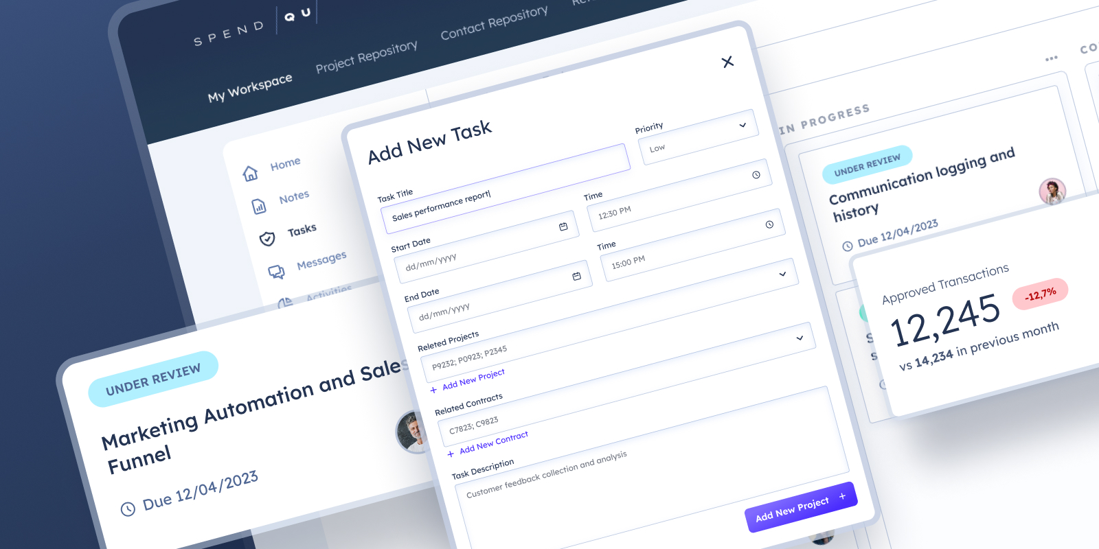
Spend Qu is focused on pioneering solutions that drive supply chain innovation, cost reduction and greater value management across top tier organizations in the healthcare industry.
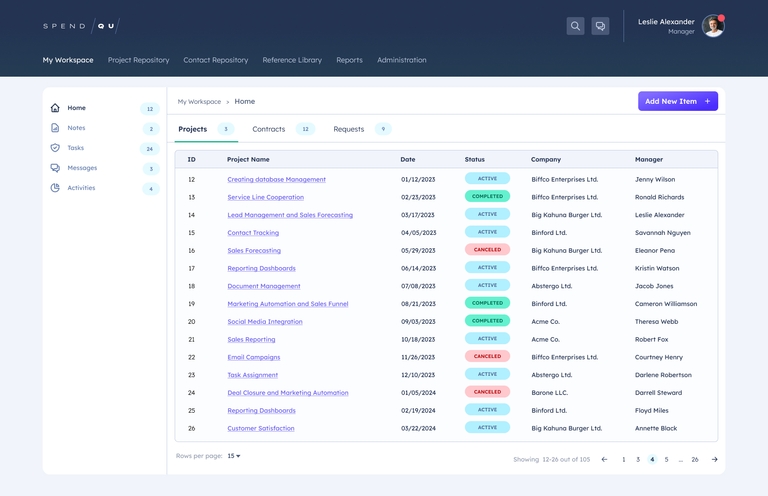
The main reason for the redesign was the frequent errors committed by users, as well as reported usability issues with the application. Furthermore, increasing competition and evolving design trends have caused the current version of the application to fall behind its competitors.
Identifying key issues with the current user interface
I began my analysis by identifying the primary issues present in the current application version. Through user interviews, I gained valuable insights into their pain points and frustrations. Additionally, I applied Nielsen’s Heuristics as a framework to evaluate the existing design and uncover potential shortcomings.
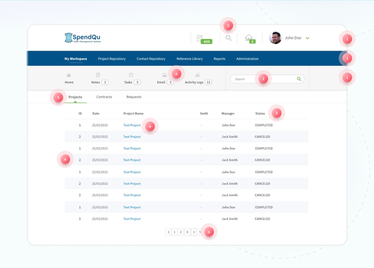
1. Navigation
Problem:
The current user interface presents three stacked levels of horizontal navigation, potentially leading to difficulties for users in finding the desired sections quickly and understanding their location within the interface.
Solution:
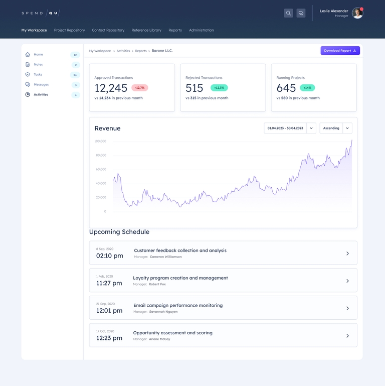
To address the navigation issues, it is recommended to simplify the interface by reducing clutter and introducing a separate sidebar navigation.
2. Search
Problem:
The search function is currently displayed in two different locations simultaneously, potentially leading to confusion and misinterpretation for users.
Solution:
To improve user clarity and avoid confusion, it is recommended to consolidate the search function into a single, prominent location within the user interface.
3. Status Labels
Problem:
The current interface relies solely on text to distinguish different statuses, making it challenging for users to quickly and easily differentiate between them.
Solution:
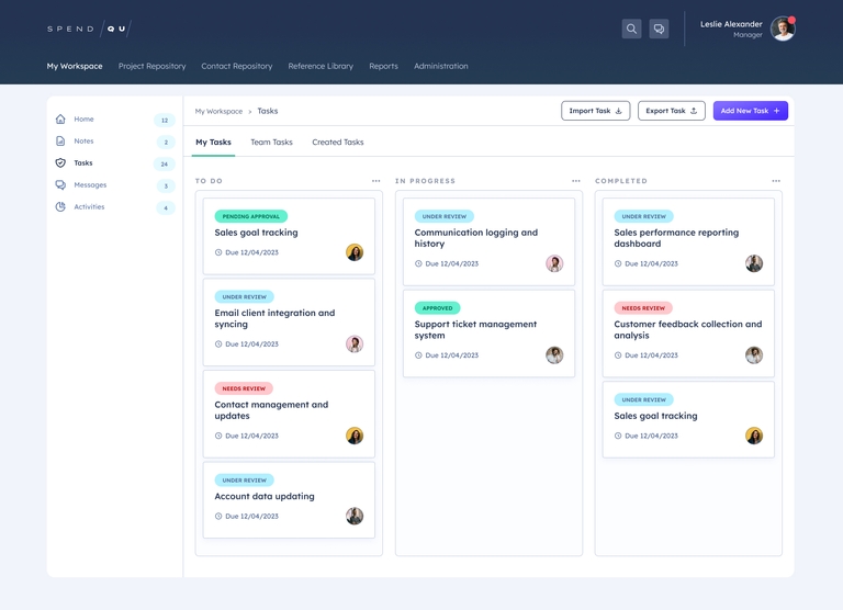
To enhance the distinction between statuses and improve user comprehension, it is advisable to incorporate color coding.
4. Links
Problem:
The current interface lacks sufficient highlighting for links, making it difficult for users to recognize clickable elements.
Solution:
To enhance the usability and user experience, it is recommended to improve the visual highlighting of links. This can be achieved by using a distinct color or underline for links, making them more noticeable and distinguishable from regular text.
5. Contrast
Problem:
The current application suffers from low contrast ratios, making it challenging for users to distinguish various elements from the background. This can negatively impact usability and accessibility.
Solution:
By increasing the contrast between elements and the background, users will be able to perceive and differentiate them more easily. This can be achieved by following WCAG Guidelines
6. Consistency
Problem:
The alignment of certain elements within the interface is incorrect, leading to a lack of visual consistency. Additionally, the text in the interface exhibits different styles and colors, resulting in a fragmented and inconsistent visual presentation.
Solution:
The elements should be aligned consistently, following a grid. Standardizing the text styles and colors throughout the application will ensure a cohesive and unified user experience.
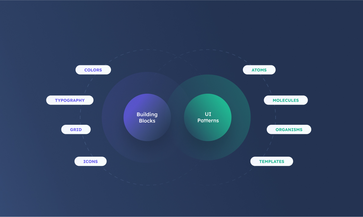
Design System Structure
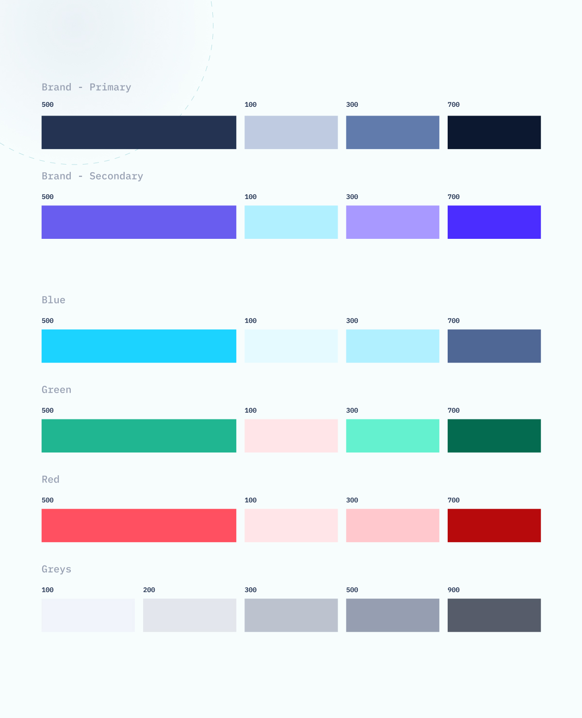
Colors
Typography

Buttons
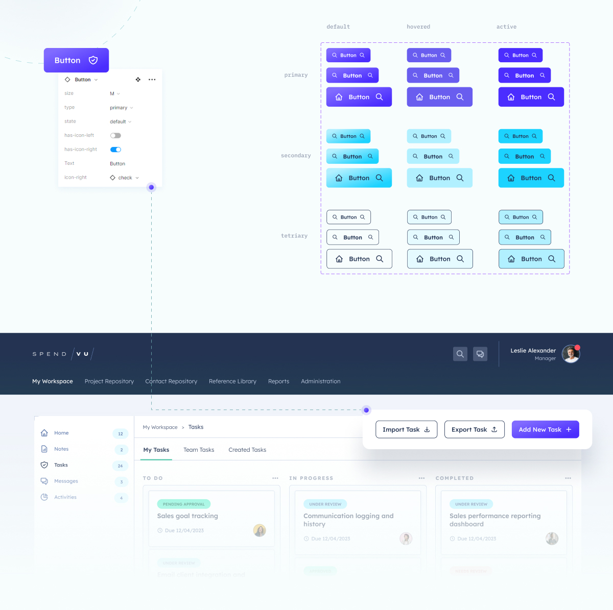
I designed a button system that meets all the requirements of the application. The buttons are available in three different sizes and colors. With the help of Figma’s features, I created a single component that manages all the button properties, including sizes, colors, states, and additional icons.
Icons
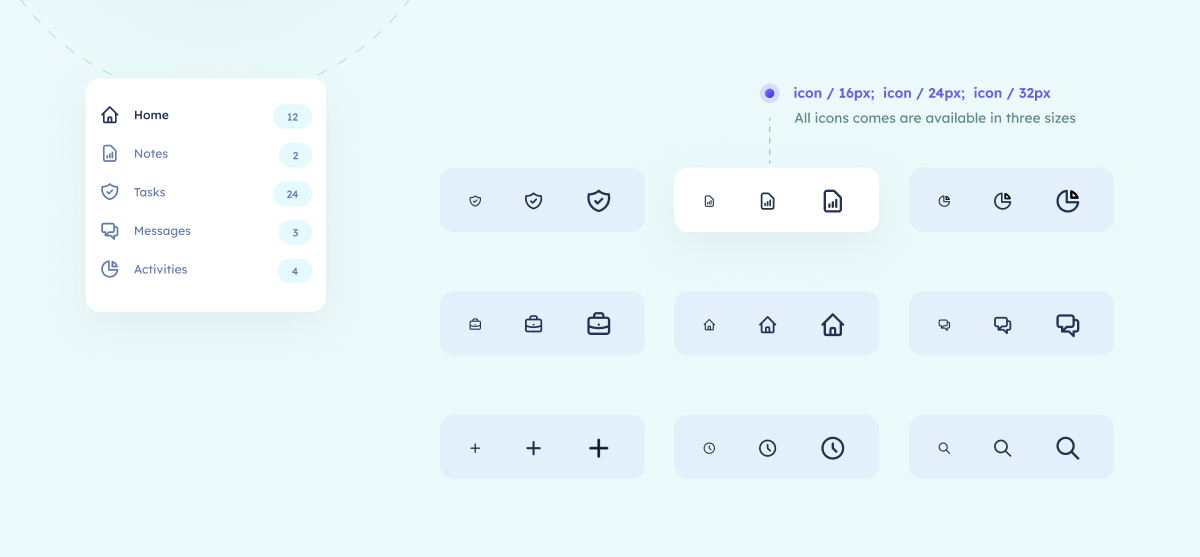
I integrated the “Heroicons” icon library, developed by the creators of the Tailwind CSS framework, into the project. This guarantees a cohesive style and seamless compatibility among all the icons. To facilitate their usage across different design elements like buttons, forms, or cards, I created a Figma library that conveniently stores all the icons.
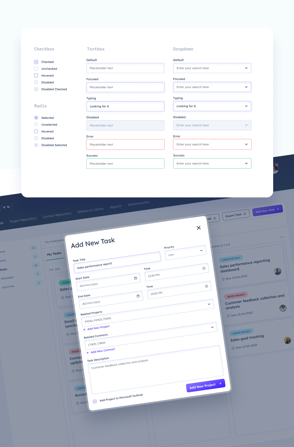
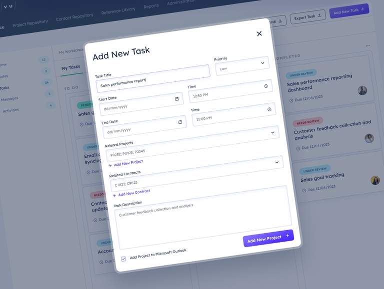
Form Elements
